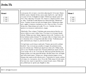
This tutorial teaches you how to create your website neatly sans tables. All along people used tables to create column layouts and templates for their websites because they shied away from learning CSS and <div>s. If you thought creating web pages with divs are difficult you are about to change your mind after reading this tutorial, because HTML tables have many problems which can be overcome using divs. Take an example of changing the size of a column while using <table> tag, expanding a column also expands the column next to it. Of course you can use colspan and rowspan attributes to correct this to an extent but that makes it cumbersome and eats up precious bytes. With tableless design in CSS you can overcome all these problems and have complete control over your design, whats more search engines also start liking your website.
In this CSS Tableless Design Tutorial I’ll show you how to create a plain three column layout using only divs. You can customize this according to your liking and add colors and background images.

Lets start by creating the HTML page
The HTML page
<!DOCTYPE HTML PUBLIC "-//W3C//DTD HTML 4.01 Transitional//EN" "http://www.w3.org/TR/html4/loose.dtd">
<html>
<head>
<title>My Website</title>
</head>
<body>
<div id="center">
<div id="sidebar-left">
</div>
<div id="content">
</div>
<div id="sidebar-right">
</div>
<div id="footer">
</div>
</div>
</body>
</html>
The id attributes are pretty self explanatory, the “center” div is used to position the entire template to the center of the browser. The DOCTYPE use in the first line is very important, if you don’t use it CSS centering won’t work in Internet Explorer. Any DOCTYPE (HTML or XHTML, Strict or Transitional) can be used.
Lets move to the juicy part of the code, the CSS. The first task is to set certain values for standard elements to prevent web browsers from “assuming” it
html,
body {
border: 0;
margin: 0;
height: 100%;
width: 100%;
}
If these attributes for html and body elements are not set, the webpage will display differently on each browser as each browser has its own style of handling elements. Next up lets write the CSS code to center everything.
#center {
width: 900px;
margin: auto;
}
As mentioned earlier this piece of code won’t work in IE if no DOCTYPE is used.
Lets draw a border for all the containers and set marging and padding values to align then neatly.
#header,
#sidebar-left,
#sidebar-right,
#content,
#footer {
border: 2px solid black;
padding: 5px;
}
#sidebar-left {
margin-right: 10px;
}
#sidebar-right {
margin-left: 10px;
}
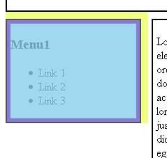
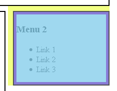
If you are wondering why I’ve specifically set margins for the left and right sidebars a look at the picture below will clear your doubts.


As you see in the picture the margins of the sidebars if generalized will not align straight with the header and footer. Finally we set the width and float the elements to achieve the three column layout
#sidebar-left,
#sidebar-right {
margin-top: 10px;
float: left;
width: 20%;
}
#content {
margin: 10px 5px;
width: 52%;
float: left;
}
#header,
#footer {
clear: both;
}
The width is set in percentages because if the overall width of the #center div is changed the elements will adjust accordingly. The “clear: both” property for header and footer will make sure the “floated” elements do not interfere with them. To wind it up link the CSS code with the HTML page using the <link> tag inside the <head> of the HTML.
<link rel="stylesheet" type="text/css" href="style.css">
This is a very plain webpage created as an example. Use you creativity to color the page. View a live demo of the CSS Tableless Tutorial example. You can add the CSS Horizontal Navigation Menu to this template. Notice that the sidebar of the pages never expand even if the #content element increases, however if you want this to happen there is a concept called “faux columns” in CSS. Watch out this space for an article on faux columns in CSS.


Love this easiest step by step tutorial ever..
Thanks…
Thanks a lot!
THANKS A LOT